Thoth is in Beta! Join our waitlist and subscribe to our newsletter for priority access!
Good design helps people grasp ideas faster, focus on what matters, and retain more. Here’s a complete breakdown of why design matters in the age of information.
.png)
In 1971, Nobel Prize–winning economist Herbert A. Simon wrote:
Over 50 years later, his words feel even more relevant. Today, we're flooded with information—from breaking news and notifications to dashboards, charts, and slide decks. But information only works when it’s understood. That’s where design comes in.
Design is no longer just about how something looks. It’s about how something works, communicates, and makes people feel. Especially when the goal is to transfer knowledge, good design becomes a powerful translator.
Human brains weren’t built for endless scrolling, but they were built to recognise visual patterns quickly. A 2014 study from MIT found the brain can process images in as little as 13 milliseconds—faster than the blink of an eye.
This means layout, color, spacing, and typography aren’t just aesthetic choices—they’re cognitive shortcuts. A well-designed infographic or interface doesn’t just “look nice”—it helps people think faster and retain more.
A 2022 study by Nielsen Norman Group found that most users only skim content online, spending an average of 10–20 seconds on a page before deciding whether to stay.
That’s a tiny window to get your message across.
Design helps filter out the noise. Visual hierarchy, contrast, and cues like icons or callouts tell people:
Here’s what to focus on. Here’s what matters.
Without those cues, even the most important ideas can get buried.
Design also affects who can access and understand your information. According to the World Health Organization, an estimated 2.2 billion people globally have vision impairment.
Without proper contrast, font size, or layout, your content becomes invisible to many.
Beyond accessibility, design also signals credibility. A Stanford study found that 75% of users judge a website’s credibility based on its visual design.
Good design builds trust before a single word is even read.
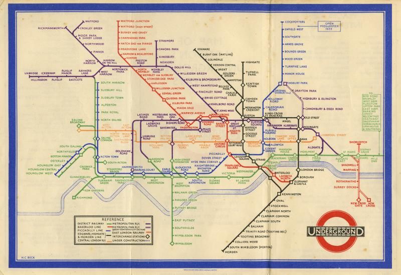
Take the London Tube map, designed by Harry Beck in 1931.
It wasn’t geographically accurate—but it made the underground system understandable.
Modern equivalents? Think of the live graphic recordings by Idea Ink capturing real-time discussions, keynotes, and workshops as compelling visual summaries.
.png)
IdeaInk’s graphic recordings don’t just document—they decode. By combining listening, synthesis, and design, they turn abstract conversations into inviting, digestible, and memorable visuals that teams actually refer back to.
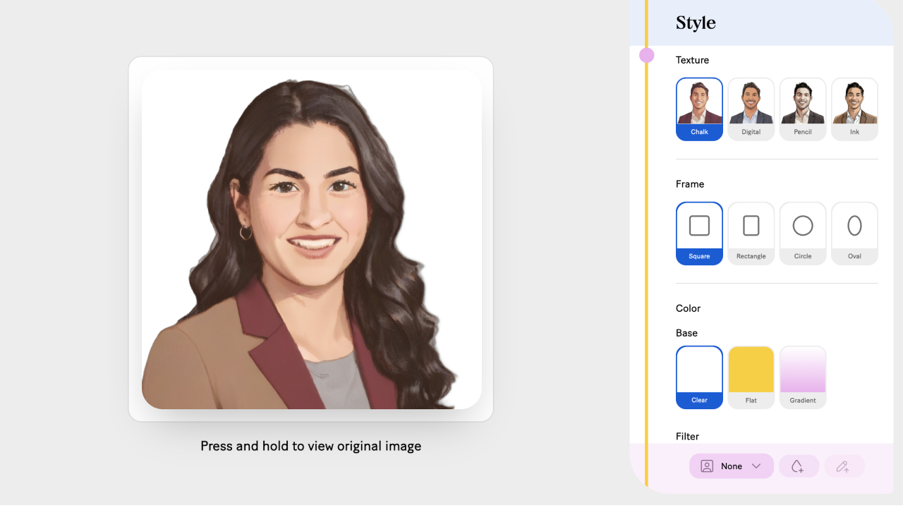
Thoth is Idea Ink’s evolution: A tool that brings our approach to clarity and storytelling to anyone, anytime, powered by artificial intelligence.
And now with Thoth, we’re making that same power of visual explanation accessible to everyone. From a blank page or a messy transcript, Thoth can turn dense content—reports, interviews, even video recordings—into clear, elegant infographics and summaries in minutes.
.png)
Whether you’re live-sketching at a summit or sharing insights from your desk, design helps decode complexity. And the good news:
Start your seamless design journey today. Join our exclusive waitlist!


%201.jpg)
