Thoth is in Beta! Join our waitlist and subscribe to our newsletter for priority access!
Smart defaults, polished visuals, faster results.

When we first launched Thoth, we gave people full freedom to tweak colors manually. But we noticed something:
That’s why we introduced templates for Themes, Colors and Frames. Our goal is to give users smart defaults that keep visuals polished without sacrificing time. So we started experimenting. What if switching the mood of your infographic was as simple as flipping a light switch? What if picking colors didn’t mean opening a hex code chart, but felt more like grabbing a ready-made playlist? What if frames weren’t just borders, but the final touch that tied the whole story together?
That’s how our latest styling update was born.
.png)
Think of themes as the lighting crew for your infographic. You’ve got three moods to play with:
Instead of fiddling with settings, you can change the entire atmosphere of your work with a single click.
.png)
Picking colors can feel like standing in front of a closet full of outfits and somehow having nothing to wear. We actually tested this ourselves by asking a few teammates who aren’t designers to build an infographic from scratch and choose their own color combos. The results? Let’s just say… informative wasn’t the same as good-looking.
That experiment confirmed what we suspected: Most people don’t want to wrestle with hex codes or spend 20 minutes debating whether “slightly teal” works better than “slightly bluer teal.”
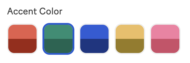
So we built template colors; Ready-made palettes that adapt instantly to any design you’re working on. Cohesive, flexible, presentation-ready. Just… done.
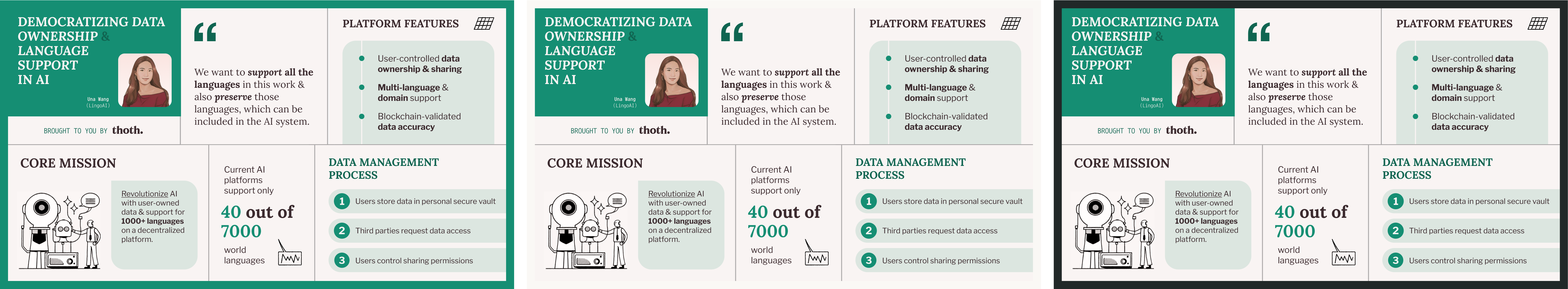
Sometimes your infographic feels complete on its own. Other times, it needs a frame—like a photo that pops once you add the right border.
That’s why we added options for Black, White, Colored, or Frameless styles. They’re subtle, but powerful: the same infographic can feel crisp, bold, or playful just by switching frames.
We didn’t want styling to feel like a chore. We wanted it to feel like putting on the right playlist before a party—effortless, fun, and instantly changing the mood.
By making design choices fast and intuitive, we’re lowering the barrier for anyone to make infographics that don’t just share information, but actually look great while doing it.
Because at the end of the day, it’s not about knowing color theory or design jargon—it’s about giving your ideas the stage they deserve.
Curious to test us out for your events?
Drop us an email at hello@thoth.art


%201.jpg)
